Pure white, product-sharp
A clean white ground with no atmospheric wash. The logo gradient is the only warm surface, so it stays an event on every page and never fades into wallpaper.
Pure white ground, sunrise gradient reserved, and motion that behaves.
Everything below is the live system this website runs on, not a mockup of one. The colors are the same tokens, the type is the same stack, and the motion demos use the same code as the homepage. Click any swatch to copy its hex.
Cafiyn is The Go-To-Market Engine for founders. The brand exists to make complex software feel calm, human, and worth trusting. Four ideas decide every design call.
A clean white ground with no atmospheric wash. The logo gradient is the only warm surface, so it stays an event on every page and never fades into wallpaper.
Every element earns its place. When a section can be removed without loss, it is removed.
Surfaces catch light and press back. Nothing is a flat rectangle floating in space.
Plain words, honest comparisons, no jargon padding. If a sentence needs a second read, rewrite it.
The Cafiyn wordmark carries a gradient drawn from the sunrise palette. In running copy it always appears with the trademark mark: 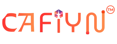 .
.
 On white, preferredOn ink, knocked out to whiteClear space: the height of the C on every side
Pure white does the work, the sunrise gradient leads (used only twice on any page), and six tone tokens keep the engine legible at a glance. Click a swatch to copy its hex.
The logo gradient (#FF3131 → #FF914D) is reserved for two places on the site: the “highlight” word in an H1, and the primary CTA. Anywhere else it appears, whether a section band, a card wash, or a badge fill, it stops reading as brand. Consume with var(--t-grad) as a background, or with -webkit-background-clip: text for text.
The yellow-family accent is retained for tint fills and hover states where the full gradient would be too loud: badge chips, hover glow, subtle icon fills.
#7C5A8A--t-plum#7BB89F--t-mint#C97B58--t-clay#FABC5F--t-sun#6A94B8--t-skyContrast rule. Body text is always Ink or Ink 2 on white. The sunrise accent never carries small text on its own: use Sun ink on a Sun fill, or Ink on Sun light.
A geometric sans for headlines, a serif for reading, and a neutral sans for anything numeric. Mixing their roles is the fastest way to break the brand.
Every surface uses a dual-tone shadow: a white highlight above left, a warm shadow below right. The light source never moves, which is what keeps the whole site feeling like one physical object.
--t-neo-outCards, panels, anything that sits above the page.
--t-neo-smChips, pills, small tiles, dense grids.
--t-neo-lgHover state and hero-level moments.
--t-neo-inInputs, wells, and inset list rows.
--t-r--t-r-l--t-r-xlpills and chipsAnimation exists to explain a relationship or reward an intent, never to decorate. Everything below is a live demo of the behavior it names, driven by the same attributes used across the site.
cubic-bezier(.22, 1, .36, 1)Fast out, slow settle. The springy variant is reserved for elements that pop in.
200ms to 800msContent animates in a single time. Nothing loops in the reader's peripheral vision while they read.
prefers-reduced-motionEvery effect is disabled at the system level for readers who ask for it. Content never depends on motion.
.t-fadeSections fade and rise once as they enter the viewport. Add .d1 to .d5 to stagger siblings.
[data-tilt="6"]Cards rotate slightly toward the cursor. Values run 3 to 6 degrees. Never more.
[data-magnet="0.25"]Primary buttons drift toward the pointer, then spring back.
[data-count="128500"]Numbers animate from zero when scrolled into view, once per page load.
[data-parallax="0.06"]Ambient background layers drift on scroll. Keep values between 0.05 and 0.4.
.t-sun-wordOne phrase per headline gets the sunrise wash. Two is noise.
Cafiyn uses Tabler Icons, outline style, at a consistent stroke. We ship a subset containing only the glyphs actually used, so the font stays small. Icons sit in rounded tiles with a gradient fill when they lead a card, and inline at text size when they support a label.
Cafiyn writes like a senior operator who respects your time: direct, specific, and willing to say what a product does not do.
More on the name, the letters behind it, and what each product does: what Cafiyn means.
Ten rules that keep the site coherent as it grows. Author each new page against this list; existing pages inherit them via pageMeta() and app/layout.js. Anything not on this list is a preference. Things on this list are non-negotiable.
pageMeta(). Every page’s metadata export goes through lib/seo.js so titles, canonicals, and OG tags stay consistent. Never hand-roll a <title> or <meta>.<meta name="keywords">. Deprecated by Google in 2009. If you find yourself listing keywords, put them in real prose and internal links instead.Article. FAQ-heavy pages get FAQPage. Step-by-step content gets HowTo. Landing / hub pages use CollectionPage via <PageJsonLd>. The homepage carries Organization + WebSite + SoftwareApplication in an @graph.--t-grad) appears in exactly two places per page: the H1 highlight (.t-sun-word) and the primary CTA (.t-btn-sun). Nowhere else.aria-label. Any <button> whose visible content is only an icon needs an aria-label that names the action.--t-cream, --t-cream-2, --t-cream-3). Bypassing tokens is how the last theme drift happened.rel="preload" fonts outside the two hero-critical ones. next/font handles Inter + Manrope. Body serif is preload: false. Adding preloads is a bandwidth trap on 3G.When a build fails on any of the above, fix the cause. Don’t suppress the check. If a rule stops making sense for the site we’re building, update this list first, then update the page.
For a vector wordmark, a founder photo, an approved product description, or permission to use the marks, write to us and we will send it over.